One of the greatest benefits of having such loyal customers is the steady stream of feedback and ideas that are freely sent our way. Everything we’ve done at ePayPolicy has the fingerprints of customer feedback. And I mean everything. From the design of our user interface to the way we fund our customers’ bank accounts, you have provided an endless supply of thoughts, ideas, and suggestions.
And when our customers talk, we listen.
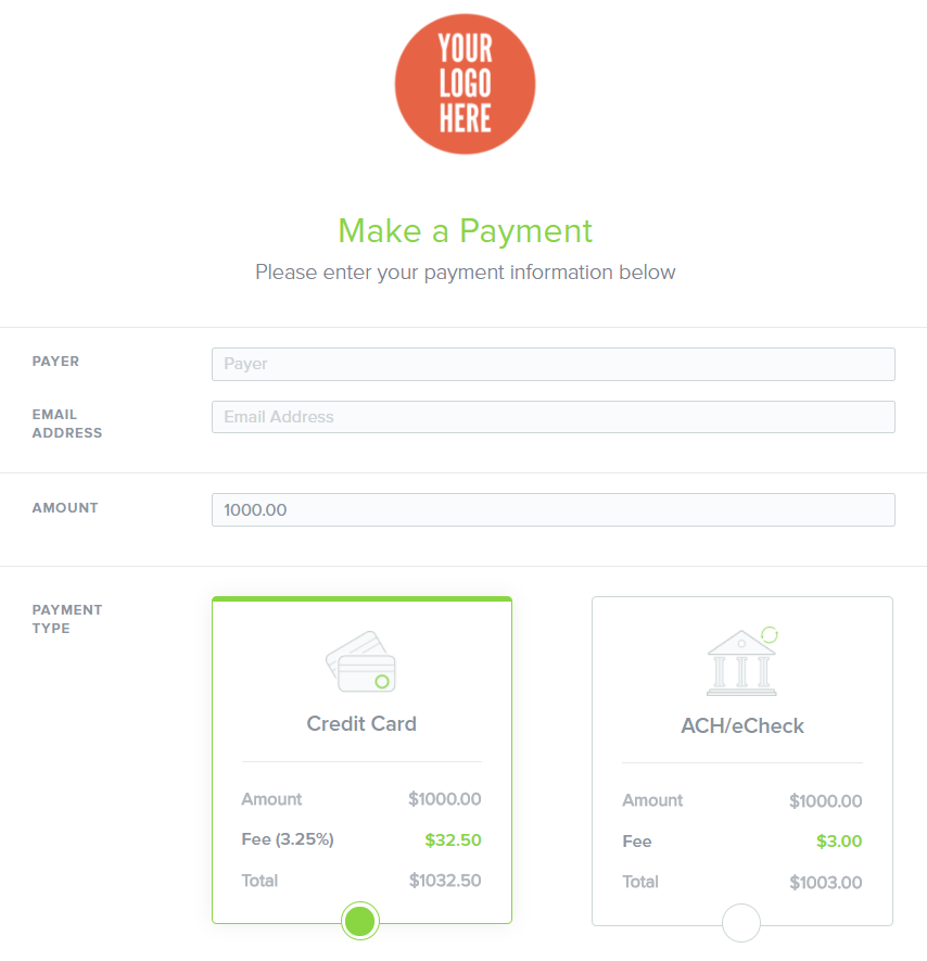
For the latest example of this, check out the newest version of our hosted payment page.
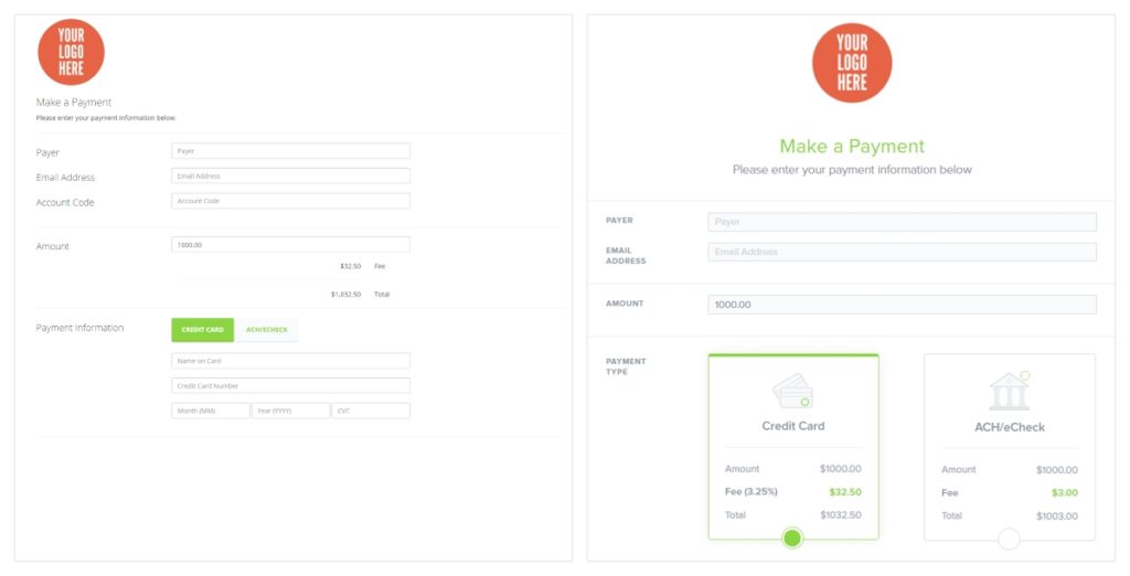
After speaking with all of you, we found an opportunity to make the fees associated with credit card and ACH payments more clear. As you can see in the new design, a payer can clearly see those fees side by side while choosing the payment method that suits them best (see the image below).
We’ve also taken design cues from our customers by centering the logo at the top of the page instead of left justifying it. This calls more attention to their branding at the time of payment.
To bring it all together, finer details were modified across the payment page and the mobile experience was upgraded for smoother, sleeker presentation for those on the go.
We aspire to have our customers feel a sense of ownership with ePayPolicy and with that comes the ability to see the impact of your suggestions. So thank you again for continuing to share your thoughts; we value that greatly.